Flight Search App
Design Course Project
As the Final Project with Springboard's Introduction to UX/UI Design Course, I chose to design a flight search application where I performed all the necessary skills that I have learned during the tenure of the course. This includes researching, ideation & sketching, working with design tools, creating wireframes, designing lo-fi & hi-fi design, and prototyping.


Research
Before diving into my design process, I started off by conducting research with competitive research analysis methodology. This information helps me understand the trends of a flight search app, what features are seen as consistent with each, and what features are prioritized over others. This ties into helping me understand a user's needs and wants, behaviours, challenges and opportunities. It ensures that I make informed decisions pertaining to both the UI and UX aspect, as well as where to focus on to ensure that the application is successful and practical. All of this is to ensure that I am building and creating something that solves their problems.
Design Inspiration & Ideation
With designing a seamless flight search experience in mind, I made sure to include a blend of functionality and user-centered design. My inspiration stemmed from a desire to simplify complex tasks, making booking travel as intuitive and stress-free as possible. I drew inspiration from clean, minimalist interfaces, focusing on clarity and ease of navigation. By analyzing top travel apps and understanding users' pain points, I crafted a design that prioritizes quick access to essential information, while maintaining an engaging and visually appealing experience.
Lo Fidelity Design
Created on Figma.
High Fidelity Design
Created on Figma.

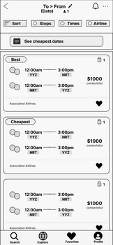
Results Screen.
Once the user inputs their flight preferences, the app intelligently prioritizes the "Best" option, showcasing the most affordable and time-efficient travel choice at the top of the screen.
Additionally, by selecting "See cheapest dates," users can view a calendar pop-up that highlights the lowest costs across all dates. This feature simplifies the process of finding the best travel dates, making it easy for users to plan their trips efficiently.

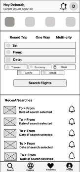
Home Screen.
The home screen of the flight search app is crafted to effortlessly guide users through booking flights, cars, hotels, or even an all-inclusive vacation. With a focus on simplicity, users can easily filter their travel options to match their specific preferences.
Additionally, the home screen conveniently displays recent searches, allowing users to quickly resume their previous selections with all their preferences intact.

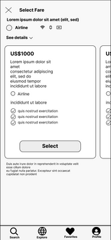
Flight Selection Screen.
The Flight Selection screen is thoughtfully designed to present all the essential flight details on a single screen, ensuring users have everything they need at a glance. It also allows for easy comparison of alternative options with a quick swipe, making it simple to evaluate and choose the best flight.
Conclusions & Final Thoughts
Challenges I faced:
-
Understanding the Full Design Process: Learning to navigate the entire UX/UI process—from research and wireframing to prototyping and user testing—can be overwhelming. Figuring out how to structure my workflow efficiently is often a challenge.
-
Defining Clear User Personas: Creating a realistic and actionable user persona based on competitive research and user interviews was tricky, especially when figuring out what data is most relevant for your design decisions.
What I Learned:
-
The Power of Research: Through competitive analysis and user personas, I realized how valuable research is in shaping design decisions. Understanding what works well in existing apps and what can be improved helped guide your design choices.
-
Design Tools Proficiency: Working with tools like Figma or Adobe XD, I became more comfortable turning concepts into tangible, interactive designs. I built confidence in my ability to quickly bring ideas to life.
-
Feedback is a Growth Tool: I learned how to embrace feedback and use it constructively to refine my design. Understanding that no design is perfect at first and that every round of feedback brings me closer to a user-friendly solution is an invaluable lesson.
For the Future:
-
More Extensive User Research: In future projects, I want to conduct more in-depth user research, including interviews, surveys, or even ethnographic studies, to better understand user behaviour and preferences beyond competitive analysis.
-
Testing with Real Users: Next time, I want to focus more on usability testing with real users. Watching how actual users interact with my app can uncover issues I might not have anticipated and provide direct insights into pain points.
Feel free to send me a message to ask me anything about this design project!


