This is
s h o p S M A R T
In the face of rising food prices, shoppers are now looking for ways to save some money in their wallets, utilizing the advanced technology that we have to secure a bit of savings. shopSMART is a unique app for grocery shoppers that can give you insights such as availability of items, location of the product, and item price check to ensure you are purchasing your item at the lowest price.

.png)

Role: UX/UI Designer
Project Duration: 4 months
Tools: Figma, Miro, Canva, UXPressia
Problems
#1
Users find it difficult to know what items are available at which grocery store locations at a specific given time.
#2
Users may go into a store only to find out that the item they are looking for is out of stock or not available at the location.
#3
Users may come to find that there is another store that carries their desired item for a lower cost.
The Idea
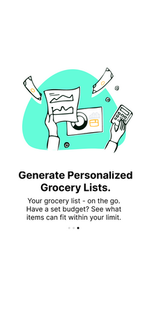
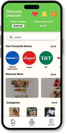
I wanted to create an app that can show the user what grocery items are available in which grocery stores, in which location, in what quantity, and at what cost with a simple search. The purpose of shopSMART is to make it easier for customers to shop hassle free by being able to check the availability of items, quantity check, and price check simultaneously.
Research
Before diving into my design process, I started off by conducting research based on the users that would be using this app and it's features. This data helps me better understand a user's needs and wants, behaviours, challenges and opportunities. It ensures that I make informed decisions pertaining to both the UI and UX aspect, as well as where to focus on to ensure that the application is successful and practical. All of this is to ensure that I am building and creating something that solves their problems.
Primary Research
Collecting original data from real world users helps me make informed decisions on the design process. To me, this is the most important step as it can provide me with firsthand information. A couple of ways that I conducted my primary research are user interviews and user surveys.
User Interview
Met with 4 users via Google Meets:

User Survey
Google Doc sent out to 11 users:
Findings
Themes:
-
Younger individuals tend to spend less on groceries in a week (average $92.14 a week for ages 18-29).
-
Amount spent increases with increasing age groups.
-
Young individuals visit a grocery store 1.5 times a week, compared to older individuals at 2 times a week.
-
82% said they are likely to visit a grocery store that has frequent discounts.
-
82% make grocery lists before every visit to a store.
-
73% do not browse online to see if an item is on sale before going into the store.
-
82% prefers to stick with a consistent brand of their essential items.
Feelings:

-
73% feel stressed about rising grocery prices. They feel like they will need to allocate more money towards groceries soon, especially the individuals who will slowly start to grow into a larger household or move out of their current home and live on their own.
-
Frustration – increased financial burden, challenge of managing a household budget
-
Stress – contributes to mental and emotional well-being
-
Worry about the future – concerns about the long-term impact of food prices to maintain a healthy and balanced lifestyle
-
Resourceful – will become more resourceful in seeking out discounts, exploring budget-friendly recipes, or finding more affordable alternative food options.
These emotions can vary based on personal circumstances, financial stability, and individual resilience.
Secondary Research
Collecting original data from real world users helps me make informed decisions on the design process. To me, this is the most important step as it can provide me with firsthand information. A couple of ways that I conducted my primary research are user interviews and user surveys.
Design System
I believe in the power of cohesive design systems to create intuitive and user-centric designs. The design system I created here showcases the inspiration behind the design, typography, colour scheme, and shapes of shopSMART.

User Persona
As part of my secondary research, I created a user persona based on my findings from my primary research and trends that I observed while conducting user interviews. I created Andrea, a 28-year old female, living with her partner in a condo at the heart of downtown Toronto. She has a stable job, but also stresses about financial costs and struggles to maintain a healthy work-life balance. What she needs is to save up enough money to be able to take the next step with her partner, to get married, start a family, and move into a larger home. Andrea's expenses consists of rent, groceries, transportation, and leisure. She wants to find ways to save wherever she can.

Site Map
I created a site map to show the customer journey as they navigate through the app. This also allows the designer to see if the flow that was designed flows well, is intuitive and clear, as well as if there are any areas where the navigation can be improved.

User Flow
Similarly, a user flow shows the path the user will take to achieve a goal or a task. This highlights touch points and interactions with certain features in the app. The goal of my user flow is to guide users to their desired outcome with minimal touch points and steps that need to be taken. This ensures that I can ensure customer satisfaction and increase engagement with my application.

Competitive Research Analysis
An important aspect of ensuring my own product's success is to take a look at other businesses with the same or similar type of product. This can tell me what companies are doing well and where they can be doing better. With this information, I can formulate my own product into what I believe can bring success to my business and where I should avoid to prevent downfall. I was also able to gather information that would help me better understand each company's business model with questions such as:
-
WHY: identifies source of competitor's success
-
WHAT: identifies the advantages over the competitors' and vice versa
-
HOW: identifies process competitor's are following, helps identify gaps in their overall service design that my product can fill.
Ideation & Sketching
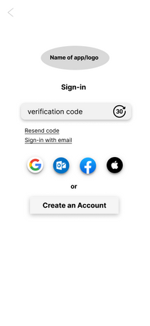
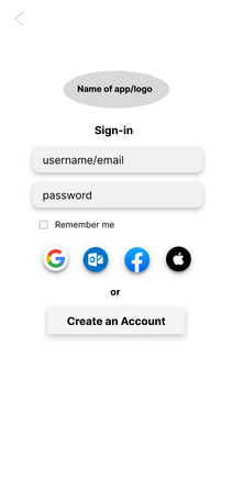
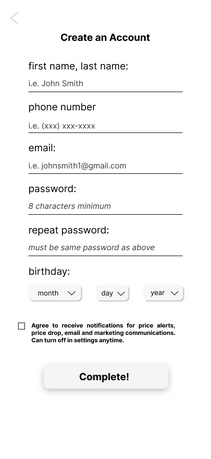
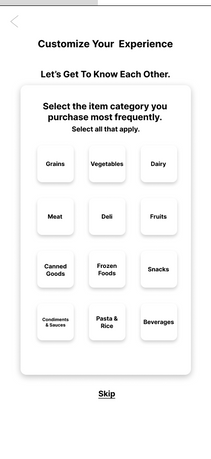
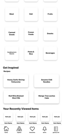
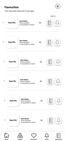
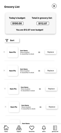
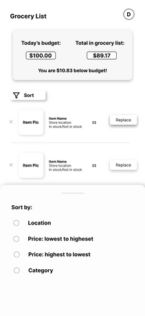
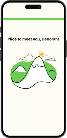
The most exciting part! This is where I can bring all my ideas, data gathered, and brainstorming that I've sketched with a pen and paper into one space - where creative and problem-solving converge and bring ideas to life. Below you will find my initial sketches that I drew out in my early stages of brainstorming, my Lo-fi and Hi-fi screens, and everything in between. Additionally, I designed my own logo to make my product one-of-a-kind and bring it that much closer to home.
Sketchings
Created on Sketchbook on iPad.
Revisions were continuously made as I constantly went back to my users for feedback on improvements.


New and improved screen added after receiving feedback from users.

Low Fidelity Design
Created on Figma.
Logo Design
Created on Figma.
The first letter of every word in the tagline "Save More And Reduce Time" spells out "SMART" as it shows how this application can help a user become more efficient when it comes to grocery shopping and budgeting.

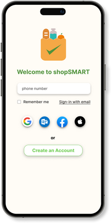
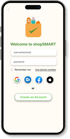
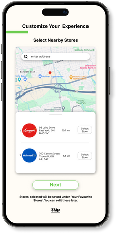
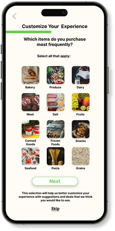
High Fidelity Design
Created on Figma.
Deeper Dive into shopSMART's Features
Below are some features you can expect to see from shopSMART and highlights that make shopSMART stand out from the others.
.png)
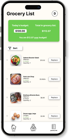
Set Your a Weekly Budget
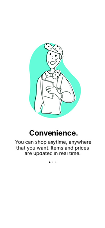
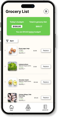
Set your budget and easily track your spending to ensure you don't exceed your limit. This feature helps you manage your finances more effectively by providing real-time updates as you shop, making it easier than ever to stick to your budget and save money.
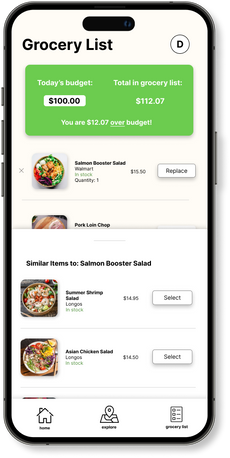
Smart Substitutions
If you receive an alert that you're over budget, you can easily select a replacement item with our Smart Substitutions feature. They will suggest more affordable alternatives, allowing you to swap out items seamlessly without compromising on quality. Stay on track with your spending while still getting everything you need.


Recipe Inspiration
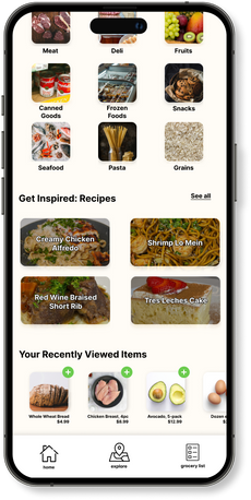
Discover culinary inspiration with our "Get Inpired" feature. Access a curated collection of delicious recipes from @kwokspots directly within the app. Whether you're planning meals for the week or looking to try something new, easily find recipes that suit your taste and dietary preferences.
Get the Bang for your Buck.
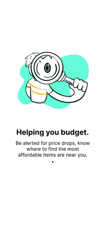
Make informed shopping decisions with our Price Trend & Comparison feature. Easily view the price trends of selected items and compare prices across all nearby grocery stores. Find the best deals and save money by choosing the store with the most competitive prices. This feature ensures you're always getting the best value for your groceries.

.png)
.png)
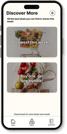
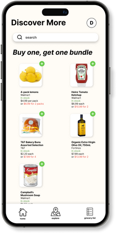
Best Deals or Nothing
Save more with our Best Deals Discovery feature. The app curates and highlights the best deals from stores around you, ensuring you never miss out on great savings. Easily browse through discounts and special offers on your favorite products and find the best prices in your area. Maximize your shopping budget and enjoy more value with every purchase.
Conclusions & Final Thoughts
Challenges I faced:
-
Understanding User Needs: Balancing the convenience of location and price with a user-friendly interface might have been tricky. I faced challenges in gathering diverse user feedback, particularly in understanding the needs of different demographics, like working professionals vs. stay-at-home parents.
-
Designing for Accessibility and Usability: Another challenge is designing the app to be easily navigable for all user types, especially considering accessibility features for individuals with disabilities. Maintaining simplicity while offering all the necessary functions was probably a balancing act.
-
Considering Mobile Optimization: Given that grocery apps are often used on mobile, optimizing the interface for smaller screens without sacrificing functionality was challenging as I had to carefully consider touch targets, screen real estate, and visual hierarchy.
-
Competitive Research and Differentiation: It was challenging to differentiate my app from other similar platforms while still maintaining the core features users expect. This involved thorough market research, ideation, and consistent feedback from users.
What I Learned:
-
The Value of Iterative Feedback: Gathering feedback at multiple stages, from wireframes to final design, helped me realize how user insights can dramatically improve usability. I learned how early testing prevents costly changes later on.
-
Importance of Clear User Flows: Through this project, I deepened my understanding of creating seamless user flows, ensuring that the app experience was intuitive from onboarding to checkout.
-
Balancing Simplicity with Functionality: This project taught me how to strike a balance between a feature-rich app and a simple, easy-to-use interface, which is crucial for retaining users in a competitive market.
-
Empathy in Design: I realized the importance of empathizing with diverse user groups—whether it's price-conscious shoppers or those seeking convenience—and how to design for their specific needs.
For the Future:
-
Deeper Data and User Testing: Next time, I could implement more extensive user testing or A/B testing post-launch to gain even richer insights into how users are interacting with the app and what areas need refinement.
-
More Focus on Accessibility: I would like to dive deeper into accessibility, ensuring the app is designed for all types of users, including those with visual impairments or cognitive differences.
-
Scalability and Future Proofing: While this project may have had a specific scope, in future projects, I want to focus more on designing scalable solutions that can evolve as user needs change or new features are added.
-
Enhancing Microinteractions: I also want to focus more on the smaller details like microinteractions (e.g., subtle animations or feedback after user actions) to enhance the overall experience and make the app feel more intuitive and responsive.
Feel free to send me a message to ask me anything about this design project!


